Downtown, New York, 1912
John MarinWatercolor on paper
15 1⁄4 × 18 inches
Signed and dated (at lower right): Marin 12
Provenance
The artist
Alfred Stieglitz, New York
The estate of Alfred Stieglitz
By exchange to the artist
The estate of the artist
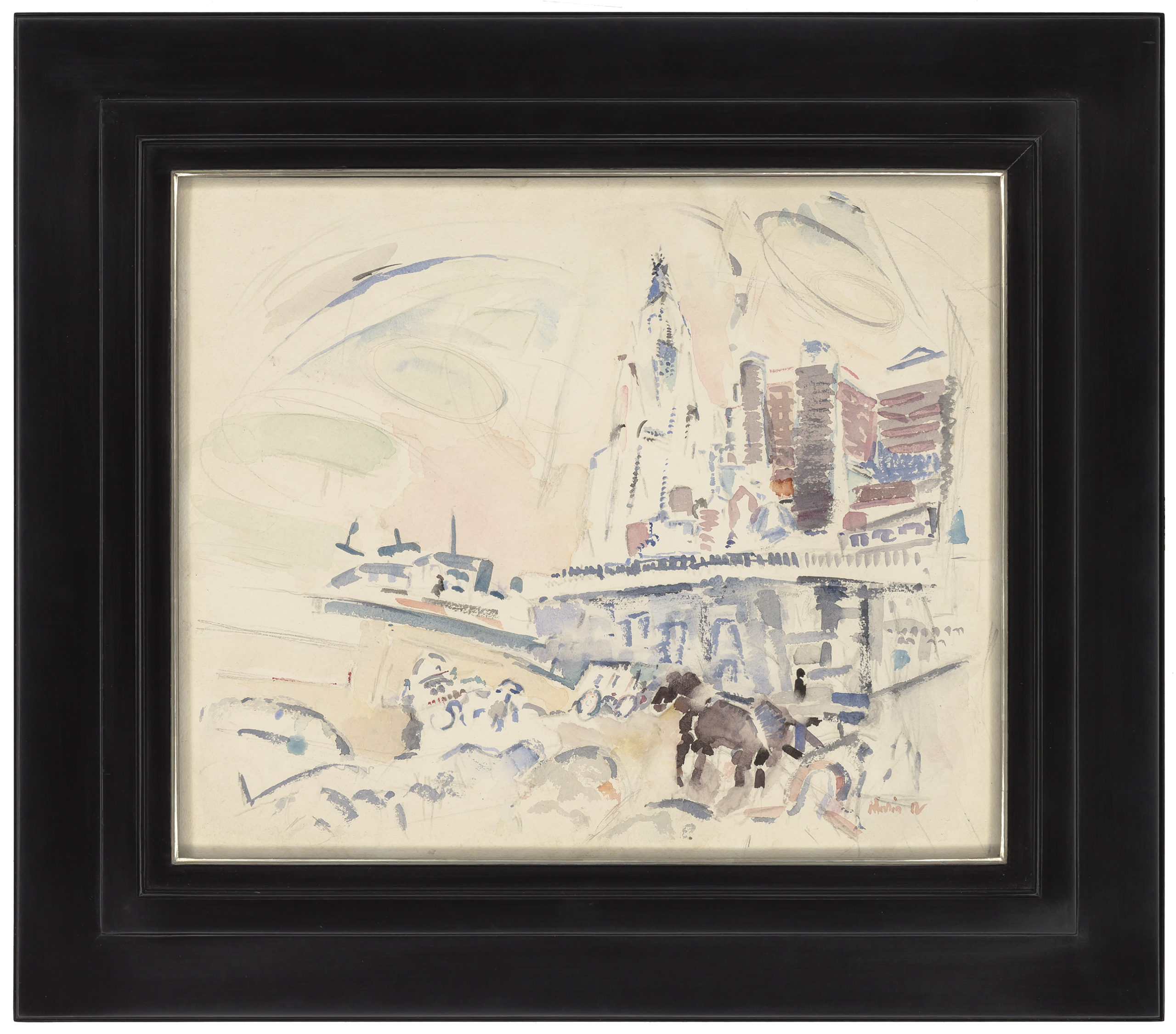
1912 marked a year of significant change in Marin’s style—it was then that the artist firmly established himself as an innovative modernist. Both his use of color and his approach to subject matter shifted from his previous style; whereas before both his palette and his rendering of objects retained more of a mid-19th century sense of impressionism, 1912 saw Marin’s abandonment of this approach. The artist’s subject matter became both more intimate and immediate; and his use of color became looser, wilder, and more arbitrary than in previous works. Downtown New York is a prime example of this newfound sense of immediacy.
At first look, it may seem as if the work was dashed off with an audacious flippancy, but upon further viewing, one begins to notice the structural potency of the composition. If there is any audacity in the work, it resides in Marin’s skewing of the major elements to the right side of the watercolor—the focal point is the more or less realistic rendering of a horse at foreground right. From there, Marin builds up the composition, first with a segment of light blue (perhaps smaller buildings), then a horizontal line formed by a succession of small vertical strokes in a deeper blue, lightening as it moves to the right. Above this, Marin presents the towering buildings of downtown New York, a secondary focus of the watercolor, in which the vertical shapes are painted with relatively broad horizontal shapes in tones of reddish pinks mixed with blue. In the distance, what is most likely the Woolworth Building hovers, almost ghostly in its spareness of color and line.
To the left of all of this activity, Marin provides only a modicum of paint—a blue slash across the sky, several very pale circular washes in green and pink, and at center three upside-down T shapes—probably semi-abstracted ship forms. And then below, a series of seemingly arbitrary, fully abstract notations in red, blue and gray, thus providing an offsetting anchor to the skyline forms of the upper right.
So again at first glance, one could say that this work pulls the viewer to concentrate solely on its right side, but Marin’s innate sense of composition won’t ultimately allow such a reading—the many volumes on the right lead one to consider the far sparser side of the left, creating, as is usual in the best of Marin’s work, a sense of unification, a sense of completeness.
Exhibited
- John Marin: The 291 Years, Richard York Gallery, New York, 1998-99, no. 7, illus. in color.
Literature
- Reich, Sheldon. John Marin: A Stylistic Analysis and Catalogue Raisonné, 1970, vol. II, no. 12.18, p. 364, illus.
- Kramer, Hilton. “Reintroducing John Marin, Forgotten Modern Master,” New York Observer, December 14, 1998.
- Johnson, Ken. “A Restless Explorer of Early Abstraction,” New York Times, December 25, 1998.